

The 2027 Paint Colours of the Year (and How to Use Them in Your Home)
By Tri City Painters ·
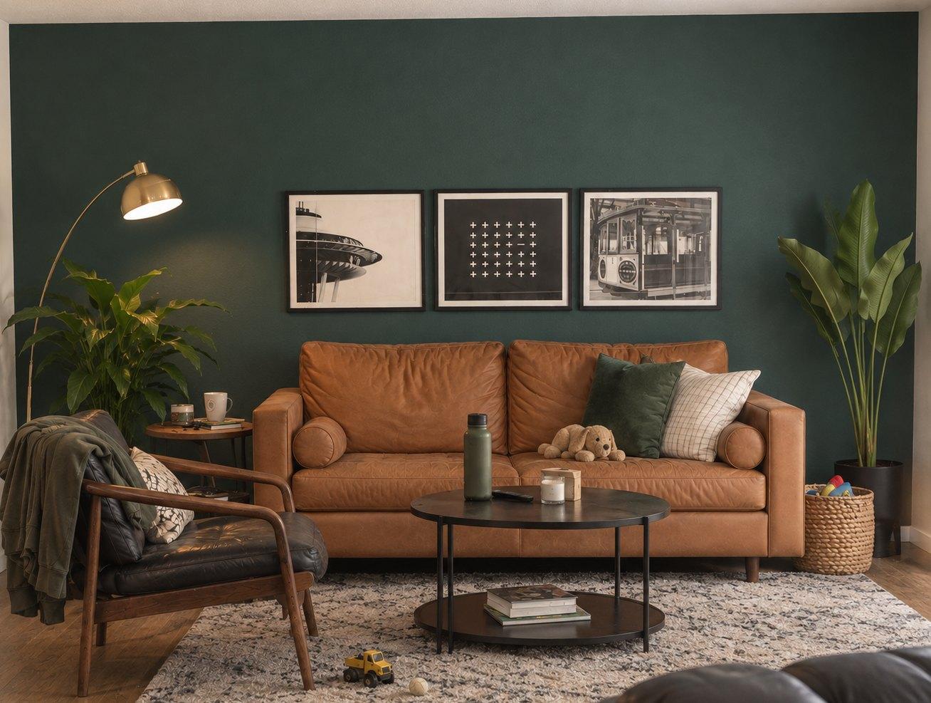
Every fall, the big paint brands announce their colour of the year, and the 2027 picks are in. This year has a clear theme: green. Benjamin Moore, Sherwin-Williams and Behr all chose a green, ranging from deep and classic to pale and fresh.
If you’re looking for the best interior paint colours for 2027, these picks are a good place to start, and winter is a great time to repaint a room or two. Here’s what each brand chose, what the picks have in common, and how to use them in a real home in Kitchener, Waterloo, Cambridge or Guelph.
The 2027 colours of the year
Here are the 2027 picks from six major paint brands. Three chose a green, two chose a blue and one chose a soft pink:
| Brand | 2027 colour | What it looks like | Try it in |
|---|---|---|---|
| Benjamin Moore | Webster Green HC-130 | A rich, classic green with plenty of depth, from the Historical Colours line | Living rooms, studies, kitchen cabinets, front doors |
| Sherwin-Williams | Celery SW 6421 | A pale, fresh green with a yellow undertone | Kitchens, bedrooms, any room that needs brightness |
| Behr | Grounded T27-01 | An earthy olive-moss green with subtle brown undertones | Living rooms, kitchens, exteriors |
| Glidden | Artifact PPG10-16 | A warm, smoky blue | Living rooms, bedrooms, home offices, cabinets |
| Valspar | Cottage Door 8004-38E | A mid-tone blue that balances warm and cool | Living rooms, home offices |
| BeautiTone (Home Hardware) | Rosewater TR27-2-1 | A soft pink with subtle yellow undertones | Bedrooms, living rooms, feature walls, interior doors |
The brands also suggest colours to go with their picks. Sherwin-Williams pairs Celery with White Flour SW 7102 for a soft, relaxed look, or with Artichoke SW 6179 for more depth. Valspar pairs Cottage Door with Moon Shot 8005-2B, a warm grey, and light wood tones. Benjamin Moore’s eight-colour 2027 palette includes White Down OC-131, Nelson Blue CW-635, Shakespeare Tan 228 and Townsend Harbor Brown HC-64.
Pantone, which sets colour standards rather than selling paint, usually names its colour in December and hadn’t announced a 2027 pick when we published this.
Where to find these colours in Waterloo Region
Benjamin Moore is sold through independent paint retailers, Sherwin-Williams through its own stores and Behr at The Home Depot. Rosewater is exclusive to Home Hardware, the Canadian chain headquartered right here in St. Jacobs. Glidden and Valspar selection varies by retailer in Canada, so confirm the colour with a store before you plan a room around it.
The bigger trend: warm colours from nature
For 2027, cool greys are giving way to warmer colours drawn from nature. Glidden says outright that Artifact reflects a move away from cool greys. The other palettes point the same way: Benjamin Moore’s includes a golden tan, a spiced brown and a grounded burgundy, and Behr’s spans warm neutrals, clay, muted pinks and airy blues.
Green is the standout. Muted greens like Grounded sit somewhere between a colour and a neutral, so they’re easier to live with than you might expect.
How to use them, room by room
Start with what’s staying in the room. When you’re choosing paint colours for a living room or anywhere else, your floors, countertops and large furniture all have undertones the paint has to work with, so hold your sample right up against them.
- Living room: Go deep. Webster Green or Grounded on all four walls feels cozy in winter, especially with warm wood, leather and cream trim. Not ready to commit? Try one wall behind the sofa or the inside of a built-in bookcase.
- Kitchen: Paint the island or lower cabinets in Webster Green or Artifact, and keep the uppers and walls light. Celery works on kitchen walls when you want brightness. If the cabinets are the main job, see our cabinet painting service.
- Bedroom: Calm colours work best here. Try Cottage Door or Artifact for a restful blue, Celery for something lighter, or Rosewater for a warm blush.
- Home office: Artifact or Cottage Door give the room enough depth to keep it from feeling flat, without being distracting.
- Front door: Webster Green is a classic front door colour. Save that one for spring, when it’s warm enough to paint outside.

Tips before you commit
- Test big. A paint chip is too small to judge. Use a large sample board, or paint a patch about two feet square, and live with it for a few days.
- Check it in winter light. Low winter sun makes colours look darker and greyer, especially in north-facing rooms. Look at your sample in the morning, afternoon and evening, under your own light bulbs.
- Pick the right sheen. Matte or eggshell suits living rooms and bedrooms. Kitchens, bathrooms and trim need a washable satin or semi-gloss.
- Plan for extra coats. Deep colours like Webster Green often need a tinted primer and an extra coat to cover evenly, and a pale colour like Celery needs primer to hide a dark wall underneath.
- Put trends where they’re easy to change. If you might sell in the next few years, use trend colours on an accent wall, a powder room or an island, and keep the main rooms more neutral.
Bring a 2027 colour home this winter
Interior painting is ideal winter work, so there’s no need to wait for spring. We work with premium brands including Benjamin Moore and Sherwin-Williams, and we can also use paint you supply. Tri City Painters paints homes across Kitchener, Waterloo, Cambridge, Guelph and the surrounding area, including Elmira, St. Jacobs, New Hamburg and Ayr.
Call (519) 570-4777 or email info@tricitypainters.ca, or request your free quote online.